


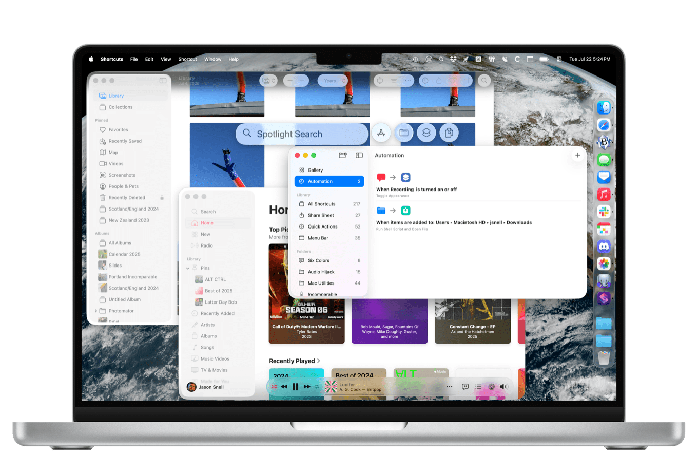
For many years, Apple’s annual operating-system cycle seemed to be all about the iPhone, with the occasional bone thrown to the Mac or iPad. But Apple’s latest operating-system releases (all synced up as version 26)—due this fall and available now as a public beta—are spreading the love around.
Yes, macOS Tahoe inherits a new design language that feels like it was designed for other devices. But look closer and you’ll find the biggest updates to Spotlight ever, including direct access to app actions and Apple’s first-ever clipboard manager. Shortcuts also gets a huge productivity boost, both from the introduction of automations and from access to Apple’s AI models.
There are a bunch of other little improvements, too. I won’t lie: that new design is a mess, though Apple appears to be making progress, and there’s still time to address some of its biggest issues. But after using early releases of macOS Tahoe, I’m willing to say the productivity gains will outweigh whatever design quirks we might have to put up with as Apple figures out how to apply its design to the Mac.
They called him Mr. Glass

Apple’s new design, founded on the concept of “Liquid Glass” material, is spread across its version 26 releases, but it feels underbaked (underkilned?) in macOS. To be sure, there are a lot of new flourishes: the menu bar is transparent by default, the Dock has gained a new glass-textured background, icons have been redesigned, and there are a bunch of interface elements that look… different. But it’s not quite as dramatic a set of changes as you might find on iOS and iPadOS.
The new design on the Mac doesn’t feel light and glassy, as it does on iPhone and iPad. It’s just a bit of a muddle. I keep noticing how terrible toolbars look in macOS Tahoe, and toolbars are everywhere on the Mac. Apple’s stated design philosophy is to build interfaces that allow content to flow behind them, showing through (a glass, darkly?). The official line is that this makes more space for your content—but, of course, sometimes using computer software means using interfaces to manipulate content and data and other stuff, and it feels like Apple has lost its balance in a quixotic attempt to make every app look like a photo editor.
I also have to point out the hypocrisy of Apple claiming that it’s building better frames for its users’ content. That’s not what’s happening here: Apple is using our content as decoration for its interfaces, using blurred and distorted versions of our images and words to show off those glass interface elements. Sometimes, it works: the feel of a canvas sliding under a bunch of glassy interface elements makes the whole thing feel like a harmonious whole. Other times, it feels like the interface and the content have both been obscured into unusability—and that’s bad.
Where was I? Right, toolbars. In their ideal form, icons can be grouped together in little glass bubbles that float above the interface, and can even animate as modes change. It’s not a bad idea, because having icons inside bubbles provides them with some depth that a purely flat design can’t offer. I don’t miss having a toolbar full of indifferent glyphs that might do something when I click on them, which has been the state of affairs on macOS for quite some time.
But in most contexts on the macOS Tahoe beta, these bubbles don’t look like glass. They look like flat light gray ovals separated from a featureless gray expanse by an amateurish drop shadow. Occasionally, when scrolling content underneath the toolbars, they do spring to life and seem to give off the effect Apple wants, but of course, many (most?) Mac apps just don’t work that way, since the important content is in the window, not sliding through the toolbar. (Take a look at Notification Center, which seemingly has no glass appearance at all.)
There are also readability issues involving dark content sliding under light interface elements, and vice versa. When that happens, Apple tries to detect the contrast issues and change the color of the text or the opacity of the background to compensate. In every beta version I’ve tested, things have felt slightly different. I hope Apple can end up with a system that enforces readability, because if you can’t read the text or interpret the icons in a toolbar, it doesn’t matter how pretty things are.
The result of this feels more like a work in progress than a finished design, and since this is a beta, that’s fair enough. But I get the sense that this really is a design that’s been thoroughly considered for iPhones, is similar enough on the iPad to be in the ballpark, but that has not really been thought through on the Mac. At least, through the first few developer beta releases, there are signs that Apple is making progress adapting this design to the Mac. I hope it continues, because it’s still in a state of disrepair.
In day-to-day use, the design issues don’t really affect how I use my Mac. I have found macOS Tahoe to be perfectly usable, and there are moments of beauty punctuated by moments where it feels like I’m using a bad Photoshop mock-up of an interface. I’m not against change at all—in researching this story, I spent some time poring over Mac OS X Tiger screen shots, and wow, I do not want to go back. But right now, this design is incomplete on the Mac, and it’s Apple’s responsibility to think it through and make it work.

As a part of the new design, Apple has also decided to enforce its new style of icon via the stick rather than the carrot. Icons of apps that don’t fit within Apple’s designated and approved rounded rectangle are forcibly shrunk down and placed inside a gray roundrect. Since most modern Mac icons do attempt to put their own spin on Apple’s format, the icons end up being boxes inside boxes. It’s ugly.
This is all fine for a beta period, I suppose, but it should never ship. If an app developer has a reason for their icon to diverge from the norm, it should be allowed to do so. Apple’s tactics leave no room for experimentation or whimsy, for apps to declare that they are so creative that they burst outside the box. (If only some of Apple’s classic icons, like Preview, were allowed to slightly diverge from the corporate edict.)
Apple has provided new icon-design tools that pick up fun aspects of the Liquid Glass approach, and most apps will be shaped as Apple wants. There are enough reasons for developers to get with the program. They don’t deserve to have their apps shunted into a shame box for daring to contradict Apple’s decrees.
Apple has also decided to make folders fun again by repurposing one of the Finder’s least-used features, tags. Tags are an organizational system that lets you apply little colored highlights or dots to individual files or folders in the Finder and then search for them. In macOS Tahoe, if you apply a tag to a folder, it doesn’t just get the little colored dot—the folder itself turns that color. You can also now assign a symbol or emoji to a folder, and it’ll appear on the folder icon.
I am a big fan of letting users customize their Macs, and have been for years. The old Labels feature in Classic Mac OS did this, and it’s nice to see Apple embrace this feature again. But this also feels like an unfinished feature. You can tag files, but file icons don’t pick up color. If you drag a folder into the Dock, it’s generic—just the default system folder color, and with no symbol or emoji unless it’s a special folder blessed by Apple like Downloads. There’s also no support for color in the Finder’s sidebar, not that the sidebar is a particularly colorful place. Once again, I hope the beta period proves that this is an unfinished feature, not a half-baked one.
A new direction for the menu bar
Ever since the very beginning, the menu bar has been a defining characteristic of the Mac interface. In macOS Tahoe, the menu bar has never been more flexible—or, strangely, more invisible.
Let’s start with the design: Apple has (once again) decided that the menu bar should be transparent. By default, the menu bar in Tahoe has no definition—it simply shows your wallpaper, with text and icons overlaid. It’s a place without being a place. There’s no there there. This feels like a decision made by the same people who added the option for the menu bar to hide when you’re not using it, and created the new optional drop-down menu bar in iPadOS 26.
A menu bar with transparent background would seem to be a readability nightmare, but I have to admit that after using it for a few weeks, I have never had any issues. macOS dynamically makes the text and icons white or black based on what’s behind, and I think it may also dim or brighten the background picture if it needs to provide a little more contrast. Whatever it’s doing, it’s been good enough for my use. My Mac feels a little more expansive and open without a solid bar at the top of the screen—not enough for me to choose it if it sacrificed legibility, but as I’ve said, I haven’t really had that issue.
The invisible menu bar does feel a bit weird at times, though. For instance, when I’ve got a window up at the top of the screen, there’s a portion of my wallpaper that just sits above it, bracketed by menu items and icons. It’s not usable space, but it feels wasted. If you try to move a window into that space, it’s repelled by an invisible force field that is the only sign that the menu bar is a powerful magical object that isn’t to be trifled with. (Fortunately, Apple has included a “Show menu bar background” setting if you’d prefer to define the geography of your Mac a bit more clearly.)
On the flip side, after adding Control Center to the Mac in Big Sur, Apple has completely revamped that system in Tahoe. If I am reading the tea leaves right, this points to a pretty dramatic revision of how the menu bar will look and function over time.
With Tahoe, Apple is adding the ability for third-party apps to create items in Control Center the same way they can on iOS and iPadOS. It has also put a Mac spin on the multi-page Control Center design of iOS and iPadOS: you can add custom pages of controls to the menu bar, each with its own icon. To do this, click Control Center and click Edit Controls. A plus symbol appears in the menu bar, and if you click on it, it’ll prompt you to choose an icon and then add controls. All controls can also be placed directly in the menu bar.
Put this all together and it sure feels like Apple is building a new vision of how the menu bar works, with old-school Menu Extras joined by individual controls as well as user-created submenus full of controls. I don’t expect that Apple will deprecate the old-school Menu Extras approach to apps putting items in the menu bar any time soon, but it feels like the company is making its preference clear: that third-party apps should create Controls that can be run either in the menu bar or Control Center.
It makes a lot of sense, especially given how crowded the menu bar can get, especially on laptops with notched displays. There are a bunch of utilities such as Bartender that have long provided users with control over the menu bar, but I wouldn’t be surprised if most traditional menu bar items disappear in the next few years, replaced by Controls.

Speaking of menu bar innovations, Apple has also extended its suite of Continuity features that allow events on your iPhone to appear on your Mac, with Live Activities. When a Live Activity spawns on an iPhone that’s nearby and linked to your Mac, the bit of it that would appear on the Dynamic Island also appears in your menu bar. And if you click, you’ll see the larger Live Activity widget that appears on the Lock Screen or if you tap and hold on the Dynamic Island.
When I upgraded to Tahoe and iOS 26, I suddenly was getting the Giants score in my menu bar courtesy of the Apple Sports app. And when the score changed—a moment when a Live Activity will vibrate your phone or Apple Watch—the larger widget briefly expanded, indicating to me that something big had just happened. I really like this feature a lot, but I admit that it made me wonder what a Mac-specific Live Activity feature would look like. I know a lot of its functionality can be replicated by other means, but having a simple menu bar entry that could auto-expand when something important happened, using the same style as Live Activities, might be a nice thing for Apple to provide to Mac apps in the future.
All told, if you were worried that Apple making the menu bar transparent in Tahoe was a sign that it wants it to fade away, I have good news: Apple has actually been hard at work making the menu bar more interesting than it’s been in years.
Shortcuts snaps into action
Shortcuts on the Mac now supports automations, a feature previously available only on iOS and iPadOS. As on those other platforms, you can now set Mac workflows to run at a particular time of day, in reaction to an alarm, when receiving an email or message, when connecting to specific Wi-Fi networks or Bluetooth devices, when connecting to a Display or activating Stage Manager, when opening or closing an app, at a certain battery threshold, when connected to power, and when activating or deactivating a Focus Mode.

Those all have their uses, but the Mac has some special automation types of its own: when a specific folder is modified, when a file is modified, or when an external drive (a specific one, or any!) connects or disconnects. This enables a bunch of new automation possibilities previously only supported on the Mac by an ancient feature called Folder Actions, which only a maniac would attempt to connect to Shortcuts. (Yes, you can also use a utility such as Hazel to automate many tasks involving changes to your Mac, but I am a fan of giving Mac users more power in the base operating system.)
The automation triggers are pretty broad. I have a longstanding automation that reprocesses Southwest Airlines calendar files that appear in my Downloads folder, which means I needed to set up an automation that triggers every single time any file is added to that very busy folder. It’s trivial to add an if-then statement to filter out all files that don’t match my criteria, but I’m a little surprised that Apple hasn’t built those filters into the top-level trigger. Still, I was able to move my automation over from Hazel in a few minutes.
There’s an awful lot of opportunity for very simple automations that can change your Mac automatically when events occur. I wired up a workflow that toggles my Mac from light mode into dark mode to a specific focus mode in about 30 seconds. I should be able to run an automation that detects which desk I’m using and adjusts a bunch of settings accordingly.
Another huge leap forward for Shortcuts across the ’26 updates is the new Use Model action, which lets you tie in workflows to Apple’s on-device and Private Cloud Compute AI models, as well as ChatGPT itself. The Six Colors staff has already built several automations using this feature, and while the results can be somewhat random and take some effort to process, they can also enable the creation of workflows that were previously impossible using Apple’s existing tools. Shortcuts also now includes pre-baked Apple Intelligence features, like Writing Tools summaries.
Otherwise, the Shortcuts app doesn’t seem improved at all. This is unfortunate. In early beta versions, the app was unstable, though I hope that’ll be cleared up before the beta process is over. (Shortcuts has had the unfortunate habit of breaking in weird ways in minor updates. There is something about it that is too brittle, and should be more resilient.) More frustratingly, Shortcuts should be getting better. It should be adding new features that aid workflow builders. (Every time I realize I’m going to have to build a set of if/else-if tests in Shortcuts, I begin pondering using another tool instead.) Instead, it seems to be adrift.
Spotlight goes pro

This year Spotlight turns 20 years old. In the beginning, it was a simple search engine for files on your Mac, but over the years Apple has upgraded it with various abilities, making it a quick app launcher, internet search engine, calculator, and dictionary, among other features.
But I have to say that this year’s Spotlight update is probably the most consequential of any of them. Back 20 years ago, LaunchBar was my go-to utility because it combined Spotlight’s features with dozens more. Over the years, as Spotlight has improved, I’ve invariably gone back to LaunchBar. So take this as the immense compliment it is: I may never go back to LaunchBar after using Spotlight in macOS Tahoe.
The new Spotlight goes beyond the single default search box, though it is still pretty effective in quickly finding a file or launching an app. Now there are four separate filters you can use for Spotlight: Apps, Files, Actions, and Clipboard. If you click on Apps (or type Command-1 after typing Command-Space), you’ll see a browsable list of apps (including iPhone apps, if you’re using iPhone Mirroring) that’s basically the replacement for the now-deprecated Launchpad. It also appears, standalone, as the new “Apps” app in the Applications folder.
Files (Command-2) will similarly let you search a filtered view of just files, and will offer some suggestions even if you don’t type anything, and provides a set of filters that let you focus on files that certain apps can open. For example, when I clicked on the BBEdit filter, I saw a bunch of recently edited text files on my Mac, including the one I used to write this story.
Actions (Command-3) offers a catalog of system and app actions, as well as Shortcuts workflows, that you can run directly from Spotlight. These are powered by Apple’s App Intents framework as well as a new “run from search” option in Spotlight. To run an action, select it and press Return, then use the tab key to move around and fill in the blanks. Apple suggests you use this for simple tasks like sending a quick email or text message, but as more apps (and Shortcuts workflows) appear, there’s opportunity for this to become a really quick way to execute commands, entirely from the keyboard, without even needing to open the relevant app.

Clipboard (Command-4) is a bit different from the previous items, in that clipboard items don’t seem to show up in default searches. This is, instead, Apple’s attempt to add a clipboard manager to macOS for the very first time. When you copy something to the clipboard, it’s not discarded when you copy something else! Instead, it’s stored for up to eight hours, and accessible from the Clipboard view in Spotlight. Just select an item from the history and it’ll be immediately placed on your clipboard or pasted right where you’re typing. Simply scroll back through time to find that thing you copied a few hours ago.
Clipboard managers have been around on the Mac for years, and Apple’s is pretty bare bones—but it’s still huge that the company has embraced this concept. And to be honest, Spotlight has all I need out of a clipboard manager. If you need more control over clipboard storage or want fancier features, there are plenty of apps like Pastebot out there that will always provide more functionality than what Apple does. My only personal issue with this feature is that it’s now two keystrokes away—something I solved by programming Keyboard Maestro to type Command-Space Command-4 every time I type my old LaunchBar clipboard history shortcut, Command-. (But really, Apple should probably let users wire all four of these filters to their own keyboard shortcuts.)
Spotlight remembers more than your clipboard, too. If you invoke Spotlight and press the up arrow, you can scroll backward through your previous Spotlight searches. This is a feature very much reminiscent of the command-line history in Terminal, and it’s a good one. Why reformulate that old query when you can just… press the arrow key a few times and get it back?
A new Quick Keys feature lets you assign actions to specific strings, to make them faster to access. It’s a great idea, but any item should be able to have keys assigned, not just Actions, and those assignments should work in the main Spotlight search area, too. Right now it’s too limited, but it’s a good start.
There are also new “slash commands” that let you quickly filter searches. Type /pdf and then press return, and your search is automatically limited to PDFs. I got it to work with Word and text files, too. It’s a nice idea, but it needs to go further: I’ve got loads of Markdown files, disk images, and even zip archives on my Mac, and it won’t let me filter for them, but I can filter for Pages documents?
Apple says it has added the ability to search popular websites from Spotlight, which would be very useful since I used LaunchBar to quickly search Wikipedia, IMDB, and other sites directly. This still seems like a work in progress—I was able to search YouTube by typing YouTube and then pressing Tab, but for IMDB I had to just type imdb tom cruise. The potential to wire data links even deeper into Spotlight is large, but the execution is all over the place right now.
Here’s a funny one: For years now, you’ve been able to type Command-? (which is technically Command-Shift-slash) to search the contents of the menus of the app you’re currently in. You can still do that, of course—and it works on the iPad now too!—but those menus are also searchable from a keyboard shortcut you might have more committed to muscle memory, namely Spotlight’s. In practice, it’s a lot messier to search in Spotlight, since it returns all sorts of results, but if you can never remember Command-?, you will be rewarded anyway.
Apple has also added a new API that will allow cloud storage platforms like Dropbox to offer their content directly in Spotlight, which might eliminate the current disparity I find when searching for content that’s on my Mac versus what’s in my Dropbox account. I look forward to testing this, if and when third-party file provider apps adopt this feature.
In short, this is a huge step forward for Spotlight. Yes, some rough edges need a little bit of refinement and attention, but after 20 years, Spotlight really has gone from being a simple search tool to a powerful utility to quickly access information and perform tasks.
And many more…
As always, there are lots of small updates and tweaks throughout the operating system. The Phone app comes to macOS for the first time in Tahoe, providing a locus for answering and placing calls via your associated iPhone. You could do that before, but those features never felt like they had a place to call their own on macOS, and now they do.
There are a few major Accessibility extensions. For years, I used my laptop on the bus commuting to and from San Francisco, or at least I’d use it as long as I could until I started to feel sick, closed the lid, and stared out the window. Apple’s Vehicle Motion Cues, which it added to iOS last year, are now available on macOS as well. The feature puts little dots on your screen, and they use your laptop’s accelerometers to react to your motion. The dots move up and down when things are slowing down or speeding up, and pan right or left when you’re turning. The idea is that your inner ear has more visual feedback of your motion, so you’re less likely to feel queasy. It works for me!
People with vision issues will also be excited about the addition of the Magnifier app, which has been on iOS for a while. It might seem counterintuitive to use Magnifier with a Mac, but the use case is actually to use it with Continuity Camera. You can place an iPhone facing outward and then use your Mac to zoom in on what the iPhone sees, which can be great for people with vision limitations.
Another app making its debut on Mac (and iPad) is Journal, which Apple brought out only for iPhone in 2023. I have no idea why it took nearly two years for this app to make it to Apple’s other devices, but the iPad and Mac both seem like better devices for journaling than my iPhone! Apple has added some sharing features so that your Mac (and iPad) has access to some of the personal data that the iPhone uses to suggest journaling opportunities.

The Music app has gotten an overhaul, and the best I can say about it is that this is just the first Public Beta and there are a few months before the app ships to rethink things. The old play controller, a part of the app since the earliest days of iTunes, has been replaced by an iOS-style floating window at the bottom of the screen. I don’t like it. It now floats over content rather than having its own dedicated spot. Time information and scrubbing controls are hidden until you move the cursor over the interface, and the volume controls are hidden behind a button and require an extra click to use.
It’s trying to copy the iOS version of Music, but even then, it doesn’t bother to pick up the very nice Now Playing view of the iOS version of Music. Instead, it’s still relying on that weird separate Miniplayer view window. I don’t know what’s going on in Music land, but as someone who uses the Mac Music app every single day, it doesn’t feel like progress.
Two steps forward, one step back
After a month using early builds of macOS Tahoe full time, I can confidently report that this is an upgrade that feels like an upgrade. The additional power of Spotlight and Shortcuts is going to delight a lot of longtime Mac users, and I’m really liking the direction Apple is taking Control Center in the menu bar.
That said, it’s also clear that the Mac is the lowest priority platform when it comes to Apple’s new design language. The beta interface feels messy and unfinished, and worse, it feels like an iOS design that’s been imported without enough consideration for how it should manifest on the Mac. I understand that the iPhone is the top priority, but the Mac deserves a version of this design that fits how the Mac is used. So far, it doesn’t feel like that.
Fortunately, this is only the beginning of the public beta process. We’ll see how the rest of the summer—and indeed, of the entire macOS Tahoe life cycle—pans out.